I Chose Cover B — Here’s Why
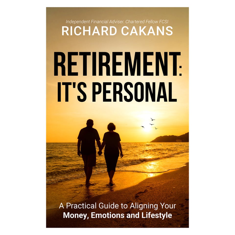
The cover above was Option A — and initially, it was the one I leaned towards. You may not know this, but I spent a surprising amount of time weighing up two cover options for Retirement: It’s Personal before making the final call.
In the end, I chose Option B.
Not because Option A wasn’t good — it really was — but because Option B did a better job of communicating what the book is about in the first couple of seconds.
The main reason: clarity at a glance
Most people will first see a book cover as a small thumbnail on a phone or laptop. Option B is bold, clear, and instantly readable. The title stands out straight away, and the overall design feels confident without losing the warm, optimistic retirement feel.
It fits the promise of the book
This book isn’t about generic retirement inspiration. It’s a practical guide designed to help you align money, emotions and lifestyle so you can make retirement decisions with confidence.
Option B felt like it matched that promise:
-
Practical and direct
-
Positive and forward-looking
-
Professional, but still personal
It “felt like me”
That might sound strange for a cover decision, but it mattered. I wanted the design to reflect the way I speak to clients: clear, calm, and focused on helping people feel confident about the decisions in front of them.
So Option B it is — and I’m genuinely pleased with where it landed.
Next step: the manuscript is currently with the formatting team, and I’ll share another update once we’re through the next milestone.
If you’re reading this and you were team A, I won’t hold it against you — it really is a personal choice, a bit like deciding when you’re ready for retirement.